Our logo design process blends strategic thinking, refined design, and meaningful storytelling. The result is timeless brand marks that not only look strong but communicate values, build recognition, and strengthen brand presence.
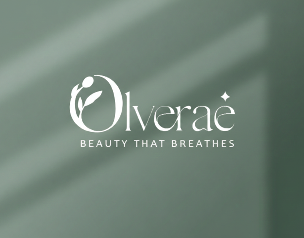
Olverae
The Olverae logo is crafted to reflect natural beauty and elegance. The leaf within the custom “O” symbolizes growth, purity, and botanical care, highlighting the brand’s connection to nature and clean ingredients. The small star represents radiance and glow, suggesting luminous results. Paired with soft, refined typography and a muted green palette, the logo feels fresh, premium, and effortlessly graceful.
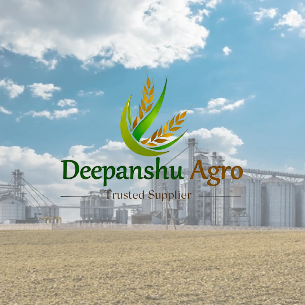
Deepanshu Agro
The Deepanshu Agro logo is crafted with a focus on growth, reliability, and agricultural strength. The combination of a rising green leaf and golden wheat stalks symbolizes prosperity, harvest, and continuous progress in the agro industry. Green reflects sustainability and connection to nature, while the golden tones represent quality and trust. The clean yet strong typography reinforces the brand’s credibility as a trusted supplier. Overall, the logo visually communicates growth, abundance, and dependable service.
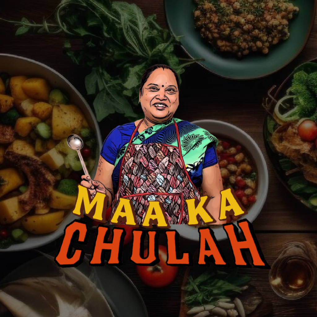
Maa ka Chulah
The Maa Ka Chulah logo captures the warmth and authenticity of homemade food through a heartfelt illustration of a mother figure, symbolizing love and tradition. The bold typography adds strong visual impact and recall, while the rich food-inspired elements enhance its cultural and comforting appeal. Overall, the logo feels emotional, trustworthy, and deeply rooted in home-style cooking.
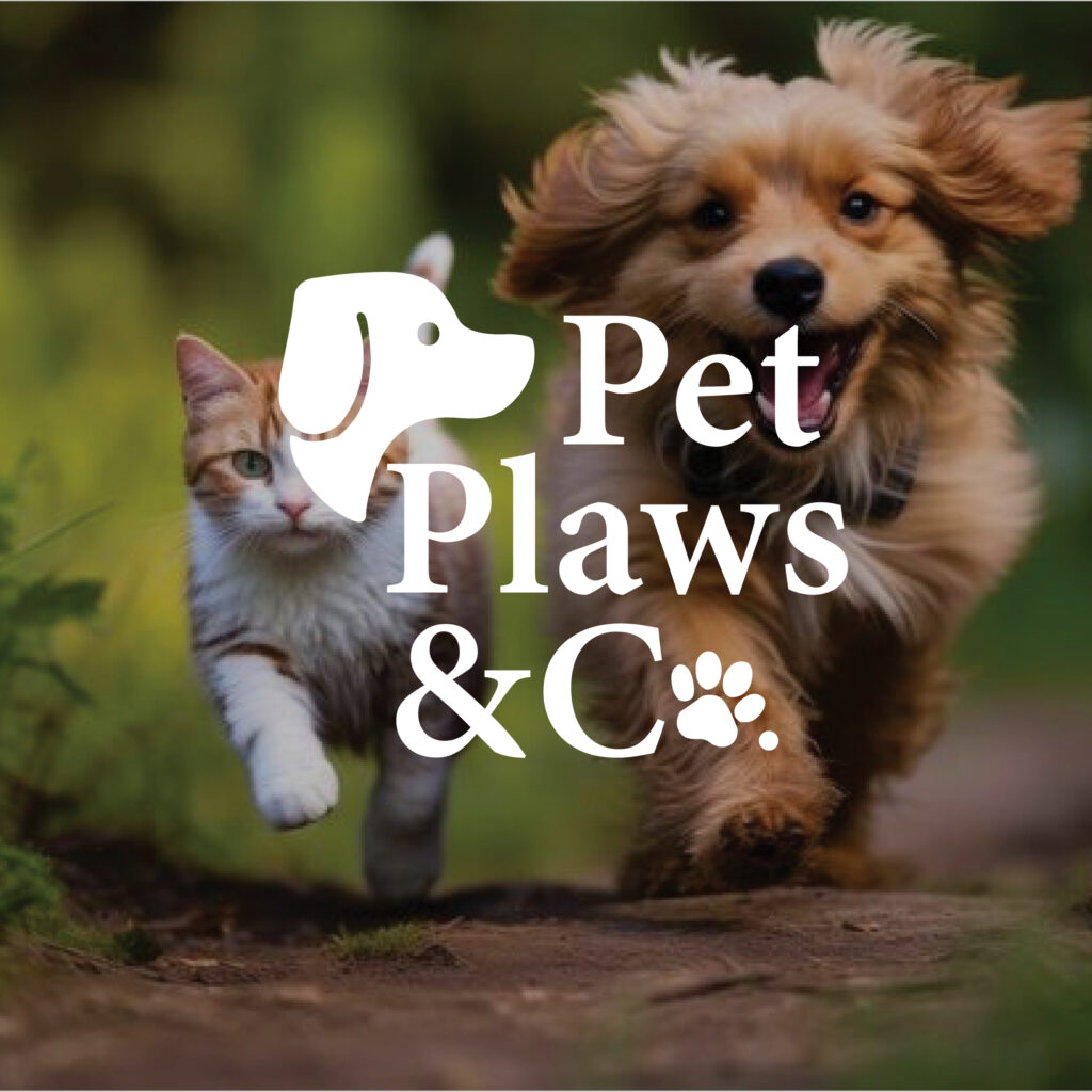
Pet Paws & Co.
The Pet Paws & Co. logo is thoughtfully crafted by combining three core elements — a minimal dog silhouette, clean typography, and a subtle paw icon. As shown in the process, each element represents care, companionship, and playfulness. These components are carefully balanced to create a simple yet meaningful mark that feels warm, modern, and easily adaptable across all brand touchpoints.